If you work with sublimation printing, you have probably heard one piece of advice more often than almost any other:
“Use the correct ICC profile.”
For someone new to sublimation, that advice is not wrong. In fact, getting the right ICC profile in place can resolve much of the confusion that comes with trying to achieve accurate and consistent colours for the first time.
The trouble is that, after a while, most experienced sublimation users realise it is only part of the picture.
You can install the recommended profile, follow the instructions carefully and still end up wondering why a colour looks slightly different from what you expected. Perhaps the reds no longer look as strong as they once did, the blues appear slightly different, or a photograph that usually prints well comes out looking a little flat after the transfer.
At that point, it is easy to go straight back to the ICC profile and assume that something must be wrong with it.
Sometimes that is the answer. More often, however, the issue lies somewhere else in the production process.
Sublimation colour is affected by far more than the profile you install on your computer. Your printer, the ink running through it, the paper you print on and the surface you eventually transfer the design onto all have their part to play. If one of those things changes, there is no guarantee that the colour result will remain the same.
This is not an article about RIP software, printer drivers or complicated colour management theory. Those topics certainly have their place, but they can make a fairly practical problem sound far more mysterious than it needs to be.
Instead, it is worth looking at sublimation colour from the perspective of the materials and equipment you actually use every day.
Your ICC Profile Depends on the Rest of Your Setup
One of the most useful things to understand is that an ICC profile does not exist independently from the rest of your sublimation setup.
It is created with a particular combination of equipment and materials in mind. That may include a specific printer model, a particular ink, a certain type of sublimation paper and a defined set of printing conditions.
This matters because the profile is based on how that setup behaves.
If the setup remains reasonably consistent, the profile has a much better chance of giving you predictable results. Once you begin changing important parts of it, the colour behaviour can change as well.
That is where many beginners get caught out.
They find an ICC profile that matches their printer, install it and assume they have solved the colour issue. After that, they often start looking for the answer inside the profile settings whenever a colour problem appears.
In reality, the same profile can behave differently once the materials around it have changed.
A Different Ink or Paper Can Change the Result
Imagine you have been using the same sublimation setup for several months. The colours are familiar, your most common products come out consistently, and you know roughly what to expect when a design goes into the heat press.
Then you run out of paper.
Perhaps your usual supplier is temporarily out of stock, so you buy a different paper to keep production moving. You use the same printer, the same artwork and the same ICC profile, yet the finished transfer does not look quite the same.
Nothing appears to be wrong with the printer, and the ICC profile has not been touched.
The paper is the part that changed.
Different sublimation papers can release dye differently during the transfer process. Some may produce stronger results under the same conditions, while others may behave slightly differently when exposed to heat. The difference might be subtle, but subtle differences become far more noticeable when you are printing photographs, skin tones or colours that need to match a particular brand.
The same principle applies when changing sublimation ink.
Two inks may work with the same printer, but that does not mean they will reproduce colour in exactly the same way. If you originally chose an ICC profile to match one ink formulation and later switch to another, it is worth checking your results instead of assuming that nothing else will change.
This is one of those fairly obvious points that is surprisingly easy to overlook:
When you change the ink or paper, your existing ICC profile may no longer be the perfect match for the setup you are now using.
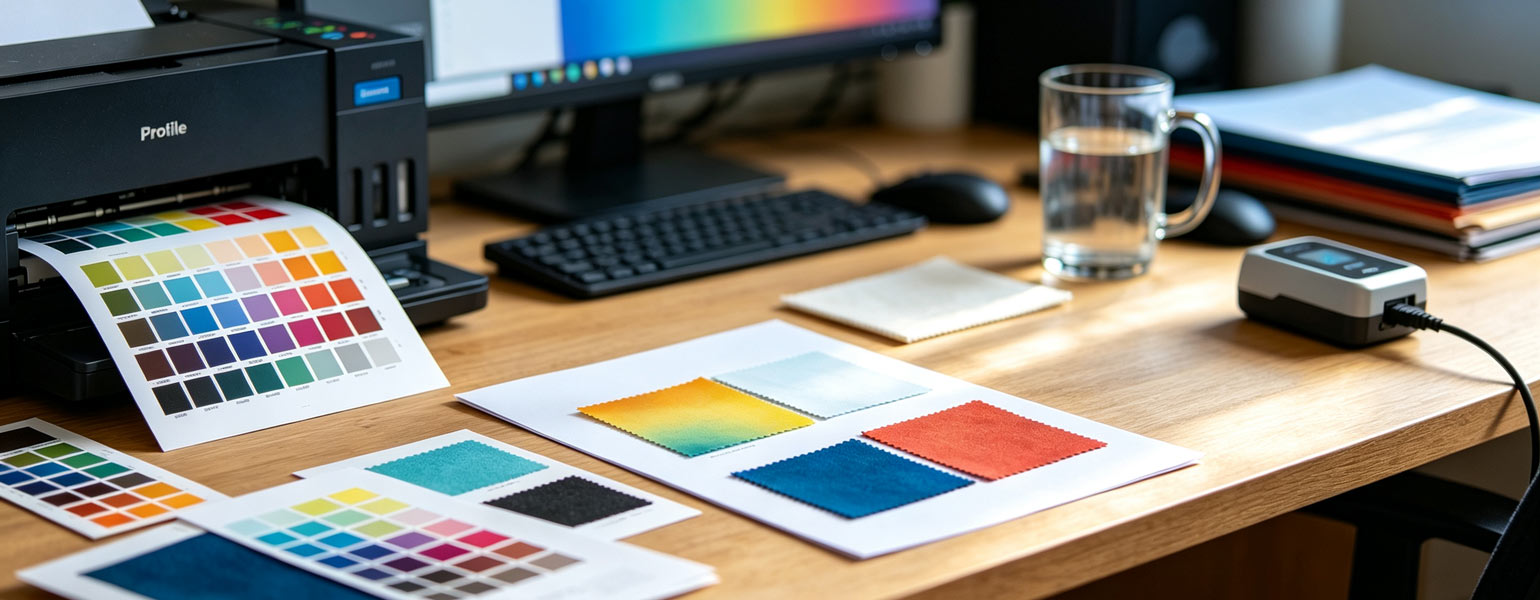
That does not mean you immediately need to create a completely new profile every time a roll of paper arrives. It simply means that a material change deserves some testing before you rely on it for a large production run. A simple way to do this is to print a familiar design using the new paper or ink, then press it onto a substrate you use regularly. By comparing the result to previous prints, you can see if the colours have changed noticeably. This straightforward approach allows you to spot any differences early and feel more confident about using the new material.
The Printer Itself Can Affect Colour Consistency
Using the same printer model does not always guarantee identical results.
Two people may appear to have almost the same setup on paper, including the same printer, ink, paper and ICC profile, yet still notice small differences in the colours they produce.
Printers are machines, and their performance can change over time.
A printer that has been in regular use for several months may not perform exactly like a brand-new machine. As print heads age, nozzles can develop partial blockages, and regular maintenance can have a noticeable impact on how consistently the printer applies ink.
Before spending hours adjusting colour settings, take a moment to check the printer itself. A simple nozzle check can reveal problems that are easy to overlook when you focus mainly on the finished colours.
It may sound like a basic step, but many people immediately blame the ICC profile when inconsistent ink output is actually causing the problem.
The Print on the Paper Is Not the Final Colour
Anyone who has worked with sublimation for a while will know that a print can look rather disappointing before it goes anywhere near a heat press.
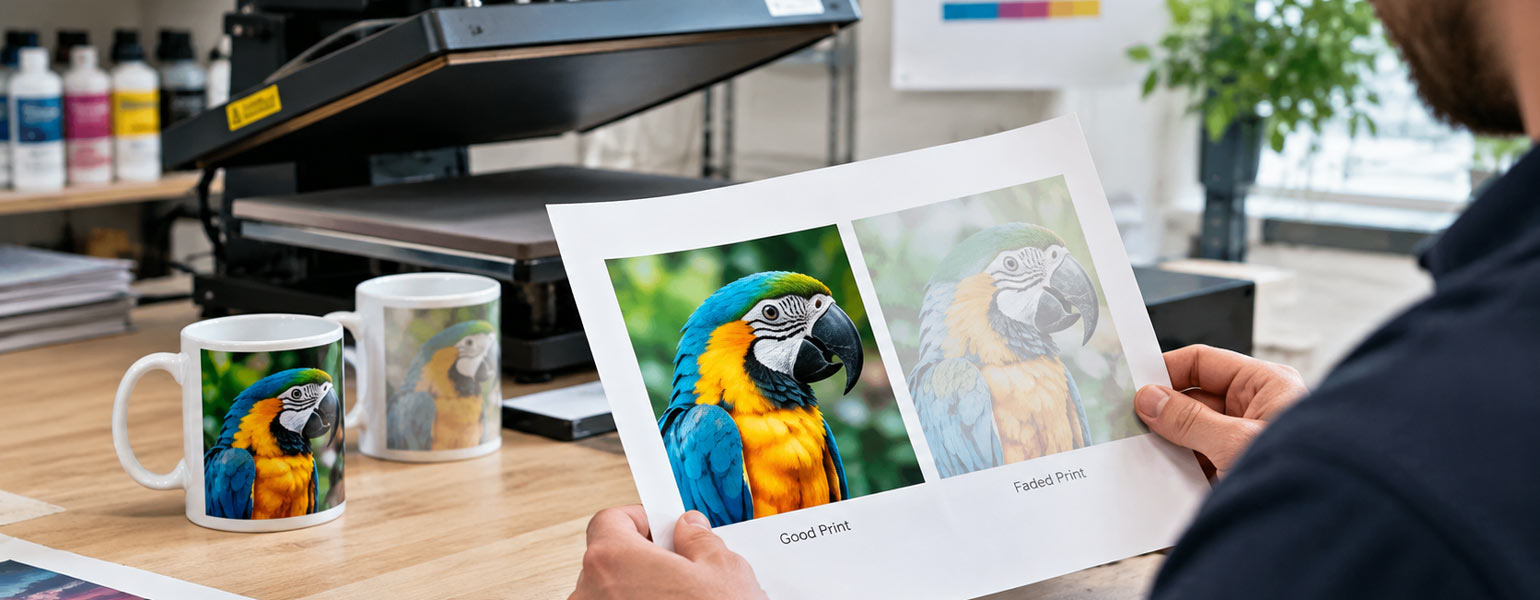
The colours on the paper may appear dull or noticeably different from what you expected to see. Someone new to sublimation can easily look at the print and assume that something has already gone wrong.
Then the transfer is completed, and the image comes to life.
That is part of the process, which is why judging colour from the paper alone can be misleading.
The result that matters is the finished product. If you are testing a new ink, paper or other part of your setup, press the design onto the actual substrate you intend to use and judge the colour there.
After all, that is what your customer will see.
The Substrate Has More Influence Than Many People Expect
A design that looks excellent on one sublimation blank may not look the same on another.
You might use the same artwork and the same printing setup, then press one copy onto an aluminium photo panel and another onto a polyester item. The finished colours can still appear slightly different because the surface receiving the dye is different.
Ceramic, coated metal and polyester fabrics do not necessarily display sublimated colour in the same way. Coatings can vary between products, while the colour and texture of the substrate can also influence how the final image is perceived.
Even similar products from different suppliers can sometimes produce different results.
A mug may look almost identical to one you have used successfully for years, yet the finished print comes out slightly warmer or less vibrant than expected. That does not automatically mean there is a fault with the mug or the printing process. It may simply respond differently to the same combination of ink, paper and heat.
This is particularly worth remembering when changing suppliers.
A new product should not automatically be treated as an exact continuation of the old one just because it has the same dimensions or a similar appearance. A few test transfers can tell you much more than the product description ever will.
Experienced Sublimation Users Usually Build a Reliable Process
Beginners often spend a lot of time searching for the perfect setting.
With experience, the focus tends to shift towards creating a process that produces reliable results.
A practical approach is to keep clear notes on which ink and paper combinations work best with particular products. Some businesses create separate profiles or colour settings for different material combinations, while others keep a few successful test prints on hand as references. There is no need to build a complicated system; the important thing is to record the materials and settings behind a result that you know works well, so you can reproduce it later without relying on memory.
This becomes increasingly useful as your setup grows. Once you begin working with several types of paper, different batches of blanks or more than one printer, relying entirely on memory can become surprisingly unreliable.
At some point, you will probably find yourself looking at an excellent old sample and wondering exactly which materials were used to produce it.
A few notes can save a great deal of guesswork.
Test Small Changes Before They Become Large Problems
One habit that experienced sublimation users tend to develop is testing whenever something important changes.
That does not mean stopping production for days and printing endless colour charts.
A small batch is often enough.
If you are trying a different paper, print one or two familiar designs and press them onto the products you use most often. When changing ink or introducing a new batch of blanks, compare the results with a product you already know well.
The purpose is not to assume that every change will create a problem.
It is to avoid discovering a difference after producing a large number of finished items.
A minor colour variation is easy to investigate when you have only pressed a few samples. It becomes considerably more expensive when the same variation appears across an entire production run.
Try Not to Change Everything at the Same Time
Colour troubleshooting can become unnecessarily confusing when several things are changed at once.
A print looks wrong, so the profile is adjusted, the heat settings are altered, and a different paper is loaded into the printer. The next attempt looks better, but there is no way of knowing which change actually made the difference.
A more useful approach is to keep as much of the setup consistent as possible while testing the part you suspect may be responsible.
If you want to compare two types of paper, use the same design, ink and substrate where possible. If you are testing a new blank, avoid making unrelated changes to the printer or pressing process at the same time.
It may feel slower initially, but it gives you a much clearer understanding of how your own setup behaves.
Colour Management Does Not End When the Printer Finishes
Although the printer, ink and paper are important, the transfer process still has a direct effect on the finished colour.
A design can be printed perfectly and still look disappointing if the heat press is not producing a consistent transfer.
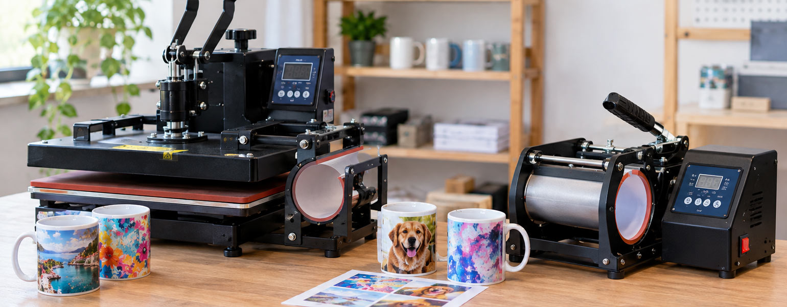
Insufficient heat or pressing time may leave colours looking weaker than expected, while inconsistent pressure can sometimes create uneven results across the surface. Different substrates may also require different transfer conditions.
This is another reason why it is worth judging your setup by the finished product rather than the sheet that comes out of the printer.
The printer starts the process. The heat press completes it.
Keep Reliable Combinations as Your Reference Point
Once you find a combination of printer, ink, paper and substrate that works well, it is useful to treat it as a reference.
You do not need to avoid trying new materials. Testing different products is often how you discover better options.
However, having a known combination that consistently produces good results makes troubleshooting much easier when something changes.
If a new paper gives you unexpected colours, you can compare it with the paper you used previously. If a new batch of blanks behaves differently, a familiar test design can help you see whether the change is actually noticeable.
Consistency does not mean refusing to change anything.
It means knowing what you changed and understanding the result.
Better Sublimation Colour Comes From Understanding the Whole Setup
Using the correct ICC profile is still important. It can provide a strong starting point and help bring consistency to your sublimation workflow.
But an ICC profile cannot work in isolation from the materials and equipment around it.
The most reliable sublimation users tend to develop a clear understanding of their own setup. They know which combinations of ink and paper work well, they test new materials before relying on them for larger runs, and they avoid changing several variables at once when troubleshooting a problem.
If you are trying to achieve more consistent sublimation colours, that practical approach is often more useful than endlessly searching for another profile.
A good result becomes easier to repeat once you know the materials and settings that produced it.
For those building or refining a sublimation setup, Signzworld offers a range of sublimation inks, papers, mugs, aluminium photo panels and other sublimation blanks that can be used across everyday projects and production work. Keeping your materials consistent and testing any new additions to your workflow is one of the simplest ways to make colour results easier to control.
The goal is not to find one setting that works forever. It is to build a setup you understand well enough to produce reliable results again and again.