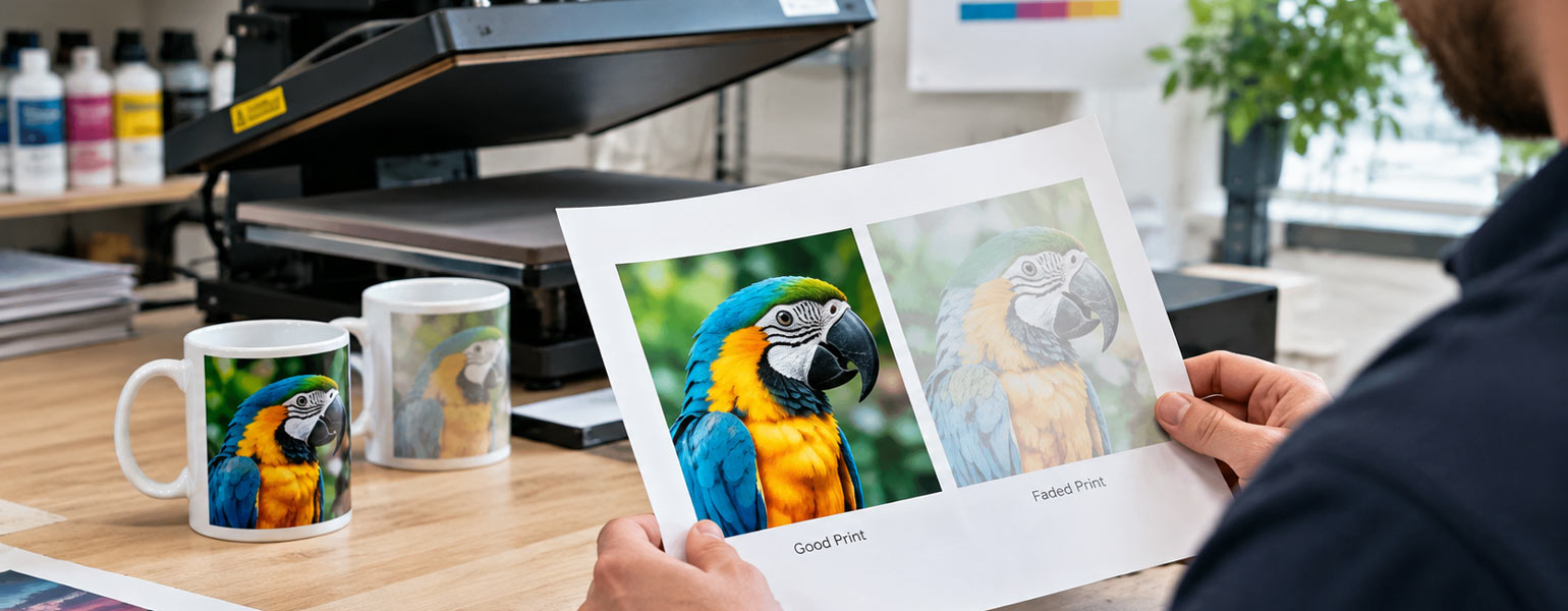
You know that feeling when you have a great idea in your head, everything looks perfect on your screen, and then the finished product comes out looking… well, completely different?
I had exactly that problem when I was making a birthday T-shirt for a friend.
It was meant to be a simple DIY gift. Nothing too fancy. I had a design with a bright red graphic, some black lettering and a few green details. I printed it, pressed it, peeled away the paper and immediately knew something was off.
The red looked more orange than red. The black had a strange brownish tone. Even the green looked a bit muddy.
So I tried again.
And then again.
Three T-shirts later, I was still staring at colours that looked nothing like the design on my screen. At that point, the birthday present was becoming less of a thoughtful DIY project and more of a personal grudge match against my sublimation printer.
If you’ve ever had this happen, you’re definitely not alone.
Sublimation colour shifts are one of those frustrating parts of the process that can make you question everything. The printer is working. The transfer looks fine. Your heat press seems to be doing its job. Yet the finished product still doesn’t look right.
The good news is that these problems usually aren’t completely random. There is normally something behind them. The trick is working out whether you’re dealing with a colour management issue, a printer problem, a heat press issue, moisture, or simply the wrong blank for the job.
Here are some of the most common sublimation colour problems I’ve come across, and the practical things I’d check before wasting another T-shirt.
Why Do Sublimation Colours Change?
There is one thing worth remembering before you start troubleshooting: the colour you see on your screen, the colour printed onto sublimation paper and the colour you see after pressing are three slightly different stages of the process.
Sublimation ink is designed to change during the heat transfer process. Before pressing, the colours on the paper can look relatively dull or muted. Once heated, the ink turns into a gas and bonds with the polyester fibres or polymer coating, revealing the final colour.
So, a transfer looking a little strange before pressing isn’t necessarily a problem.
The real issue is when the finished product is noticeably different from the colour you expected. If your red suddenly looks orange, your black looks brown, or your blue has somehow wandered into purple territory, you’re dealing with a genuine colour shift.
And not every colour shift has the same cause.
That’s where things get interesting.
Prints Develop a Yellow Cast
Sometimes the colour shift isn’t quite as obvious as red turning orange or blue turning purple.
Instead, the whole print may develop a warm yellow or slightly brownish cast. Whites and pale areas can look creamy, while neutral greys may suddenly appear warmer than they should.
This can be particularly frustrating because the original design may have looked perfectly clean and neutral on screen.
Why does a sublimation print turn yellow?
There are a few possible causes, and the first thing I’d check is whether the yellow cast affects the entire print or only certain areas.
If everything looks warmer than expected, the problem could be related to colour management. An unsuitable ICC profile or incorrect printer settings can alter the balance between the different ink colours, causing the finished print to take on a noticeable yellow tint.
Ink delivery is another thing worth checking. If the printer isn’t reproducing colours accurately, the balance of the final image can change. A nozzle check is a simple place to start, particularly if the yellowing appears alongside other unexpected colour shifts.
Heat can also affect the final appearance. Incorrect temperature, pressing time or pressure may influence how the sublimation ink develops, especially when you’re already working with a setup that isn’t well calibrated.
The sublimation paper and the blank can also make a difference. Different combinations of printer, ink, paper and polyester substrate don’t always produce identical results, so a colour profile that works well with one setup may not behave the same way with another.
How to fix a yellow colour cast
Start with the basics.
Check your nozzle pattern and make sure all ink channels are working properly. Then review your ICC profile and colour management settings, particularly if you’ve recently changed your ink, paper or printer settings.
If the yellow cast is still there, try printing a simple test image containing white, grey, black and several neutral colours. This can help you see whether the problem is affecting the entire colour range or only certain tones.
It’s also worth checking your heat press settings and testing the same design on a different sublimation blank. If the print looks noticeably different on another product, the blank itself may be contributing to the colour shift.
The key is not to start changing everything at once.
A yellow cast can be caused by several different things, so work through the setup one step at a time. Otherwise, you may fix the problem without ever finding out what actually caused it.
Blacks Look Brown
This is one of those problems that makes you wonder whether your printer has suddenly developed a sense of humour.
You choose a deep black for your design. It looks perfect on screen. After pressing, though, the black areas have a warm brown, reddish or muddy tone.
Not exactly the dramatic black you had in mind.
Why does black sublimation ink look brown?
The first thing I’d check is the colour value in the original artwork.
Sometimes what looks like black on screen isn’t actually a neutral black. A dark brown, warm grey or rich black containing a particular mix of colours can behave differently once printed and sublimated.
If the artwork looks fine, move on to colour management.
Your printer needs to reproduce the correct balance of inks to create the intended colour. An unsuitable ICC profile, incorrect printer settings or conflicting colour management can all affect the final result.
Ink quality can also play a part. Different sublimation inks don’t necessarily behave in the same way, even when used in the same printer.
What I’d try first
Check the artwork and make sure the black you’re using is actually the black you want.
Then check your ICC profile and colour management settings. If your design software is managing colours, make sure the printer driver isn’t also trying to manage them independently.
After that, run a nozzle check and make sure the printer is delivering ink correctly.
A simple test print can save a surprising amount of time here. Print several shades of black, from neutral black to warmer and cooler variations, and see how they behave after pressing.
That will tell you much more than repeatedly printing the same full-size design and hoping the next one magically works.
Reds Turn Orange
This is another classic sublimation colour shift.
You create a bright red design, but the finished print comes out looking noticeably more orange.
It’s particularly frustrating when the exact shade of red is important, such as a logo, sports design or personalised gift.
Why does red turn orange?
Red depends heavily on the balance between magenta and yellow. If that balance shifts, the final colour can move towards orange.
Incorrect colour management is one possibility, particularly if your printer and software aren’t working from the same colour expectations.
But don’t immediately blame your ICC profile.
If only the reds are affected, check your printer’s ink delivery as well. A problem with one colour channel can alter the balance of the final print.
Your display can also be misleading. Screens create colour using light, while sublimation relies on ink and heat. A vivid red on an illuminated monitor may not translate into the same shade on polyester.
How to get your reds back on track
Start by printing a small colour chart containing several different shades of red.
This is one of the simplest ways to find out whether the problem is with the printer or with the specific colour you’ve chosen.
If every red is shifting towards orange, investigate your colour management and ink balance.
If only one particular red is giving you trouble, the issue may simply be the colour value in your artwork.
It’s also worth remembering that different polyester fabrics and polymer-coated blanks can produce slightly different results. A red that looks perfect on one T-shirt may not be identical on another.
Greens Look Dull or Muddy
Green can be a surprisingly difficult colour to get right.
Instead of a fresh, vibrant green, you may end up with something dull, greyish or slightly muddy.
This is particularly noticeable with darker greens and designs containing multiple blended colours.
What’s happening to the green?
Green is created through a balance of cyan and yellow, so changes in either colour can affect the final result.
If the green is consistently too dull across different designs, I’d look at your colour management and ink delivery.
If the whole print looks flat rather than just the green areas, the problem may lie elsewhere.
Insufficient heat, incorrect pressing time, poor ink release or low-quality sublimation paper can all affect colour vibrancy.
Moisture is another sneaky culprit.
Polyester garments and sublimation paper can absorb moisture from the surrounding environment. During pressing, trapped moisture can interfere with the transfer and leave colours looking uneven or less vibrant.
A simple fix worth trying
Store your blanks and sublimation paper somewhere dry.
If you’re working in a damp environment, particularly during colder or wetter weather, a brief pre-press can help remove excess moisture from the garment.
Keep it brief, though. The aim is to remove moisture, not to give the T-shirt a full heat treatment before you’ve even printed on it.
Also look at the actual pressing result.
If one side of the design looks vibrant while another area looks dull, you may have an uneven pressure or temperature problem rather than a colour profile issue.
Blues Look Purple
Blue turning purple is another colour shift that can leave you scratching your head.
You start with a clean, cool blue and end up with something warmer, sometimes with a noticeable purple or magenta cast.
Why does blue shift towards purple?
The balance between cyan and magenta is usually the first place I’d look.
If too much magenta is being introduced, or not enough cyan is being printed, the blue can quickly move towards purple.
This is where a nozzle check becomes particularly useful.
If the cyan channel isn’t printing correctly because of a blocked or partially blocked print head, the colour balance can change even though the printer appears to be working normally.
What should you check?
Run a nozzle check before changing every setting you can find.
If the nozzle pattern isn’t clean, deal with that first.
Then look at your ink and colour profile. If you’ve recently changed to a different sublimation ink, your previous ICC profile may no longer be giving you the same results.
This is one of those situations where changing ten things at once is usually a bad idea.
Fix the nozzle issue.
Test again.
Then review your colour management.
One change at a time might feel slower, but you’ll usually find the real problem much faster.
When Everything Looks Washed Out
Sometimes it’s not one colour that’s wrong.
The entire design just looks weak.
The colours are there, but they’re pale, flat and nowhere near as vibrant as you expected.
When this happens, I’d stop looking at individual colours and examine the transfer process as a whole.
The pressing temperature may be too low. The pressing time may be too short. The pressure may not be even. Your sublimation paper may not be releasing ink effectively.
Or the blank itself may be the problem.
Not every polyester garment is equally suitable for sublimation. A high-quality white polyester sublimation blank will generally give you a much more reliable result than a random polyester garment that happens to be available.
This is where comparison testing can save you a lot of frustration.
If the same design looks vibrant on one blank but washed out on another, your printer may not be the problem at all.
The Best Way to Troubleshoot Sublimation Colour Problems
When a print comes out wrong, the temptation is to change everything.
Increase the temperature.
Change the pressing time.
Download another ICC profile.
Try different printer settings.
Change the paper.
Then wonder why the next print looks completely different again.
I’ve been there. It doesn’t help.
A much better approach is to treat the problem like a small experiment.
When I’m trying to work out what’s gone wrong, I usually start by looking at the pattern of the colour shift.
A problem with just one colour is often traced back to that particular ink channel or to the colour values in the artwork. When several colours start moving in the same direction, I’d be more suspicious of the colour management setup or the ICC profile.
A print that looks generally dull or washed out is a different story. That’s when I’d start checking the paper, blank and heat press settings rather than focusing too much on individual colours.
It’s also worth comparing the same design on different products. If the colours look fine on one blank but noticeably different on another, the blank or its coating could be part of the problem.
And when the colours look uneven across the same design, I’d take a closer look at the heat press. Uneven temperature or pressure can sometimes leave you with a print that’s perfectly fine in one area and noticeably different somewhere else.
Keep the same artwork and the same blank, then change one thing at a time.
Getting Consistent Colours Takes a Bit of Testing
After dealing with a few colour disasters myself, I’ve come to realise that consistent sublimation printing isn’t really about finding one magical temperature or one perfect printer setting.
It’s about getting the whole setup to work together.
Your printer, sublimation ink, paper, artwork, colour profile, heat press and blank all have a part to play. If one of them is slightly out of sync, the final colour can shift.
That’s why it’s worth sticking with a setup once you’ve found one that works. Keep a note of successful temperature and pressing settings. Save your working colour profiles somewhere safe. Test new blanks before using them for customer orders or important gifts.
And when something suddenly goes wrong, don’t panic and start changing everything.
Go back to the basics.
In my case, the fourth birthday T-shirt finally came out looking the way I wanted. The red was actually red. The black was properly black. And thankfully, my friend never had to know that the first three attempts existed.
That’s probably one of the less glamorous truths about DIY sublimation printing. You learn a surprising amount from the prints that don’t go according to plan.
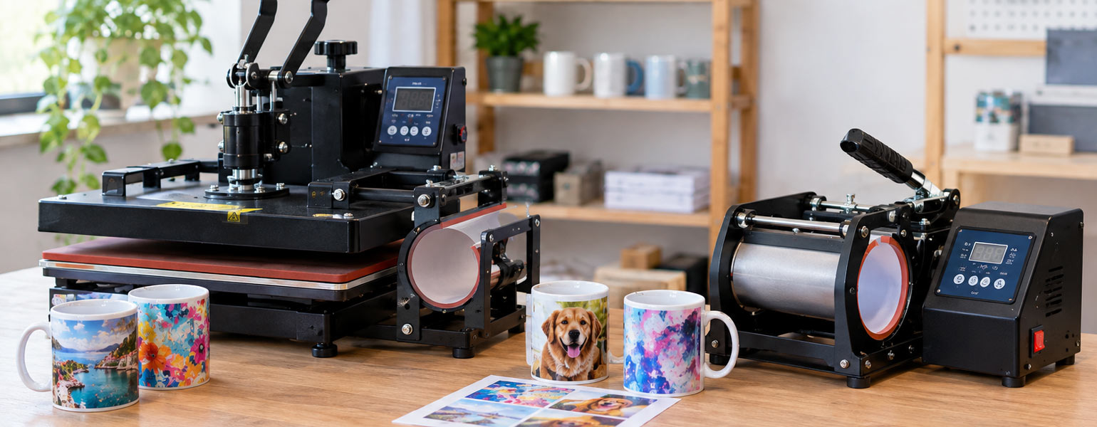
For anyone building or improving a sublimation setup, having dependable equipment and consumables makes that learning curve a lot less painful. Signzworld offers sublimation essentials including sublimation mugs and blanks, sublimation paper, heat press machines and other equipment for home makers, small businesses and more experienced sublimation printers.