There’s a particular kind of frustration that comes with sublimation printing.
You press a design you’ve made dozens of times before. With the same printer, same ink, same sublimation paper and same heat press. You haven’t changed anything.
Then you lift the press.
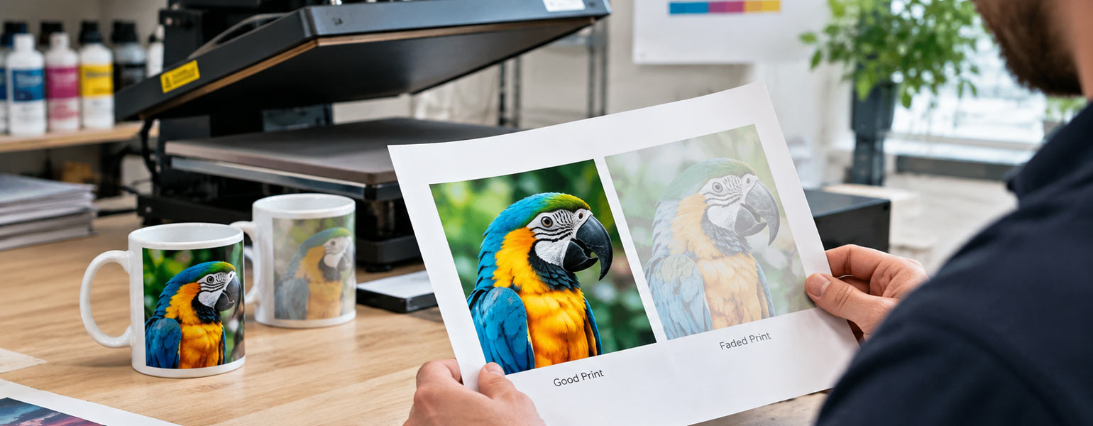
The colour looks wrong.
Not dramatically wrong, perhaps. Just… off. The red isn’t as lively. The black looks a little grey. The whole design seems softer than it should.
So you check everything.
You look at the artwork, check the ink. You wonder whether the heat press is playing up. Maybe the temperature isn’t quite right. Maybe you’ve somehow changed the pressure without noticing.
Then you look at the blank.
And there it is.
The polyester percentage is different.
It’s an easy detail to overlook. When buying sublimation blanks, most people naturally look at the size, shape, colour, coating and price first. Polyester content is often just another number in the product specification.
Until something goes wrong.
Then that little number suddenly becomes very interesting.
Polyester Content and Sublimation: What’s Actually Going On?
Sublimation ink needs polyester to bond with.
Under heat, the ink turns into a gas and penetrates the polyester fibres. As the material cools, the dye becomes part of the fabric rather than sitting on top of it.
That’s why polyester is so important to sublimation printing.
In general, a higher polyester content gives the dye more polyester fibres to bond with, which usually results in stronger, more vibrant colours.
But there’s an important distinction here.
Polyester percentage is not the same thing as sublimation quality.
A 100% polyester fabric isn’t automatically a better sublimation blank than every 95% polyester fabric. The weave, surface treatment, fabric weight and overall quality of the blank can all affect the result.
This is why two products can have almost identical specifications on paper and still come out differently under the heat press.
And that’s where things get interesting.
What Happens When the Polyester Content Is Lower?
The easiest way to understand the difference is to compare a lower-polyester blend with a high-polyester one.
Take something around 65% polyester.
You can still sublimate onto it, but the result will generally be softer. Colours won’t have the same intensity as they would on a high-polyester material, and dark shades may look noticeably less dense. For example, if you use a 65% polyester shirt, the print will have a gentle, faded look, which might appeal if you’re aiming for a vintage style, but logos or bright designs may not pop as much as you expect. On products like mugs that usually have a special polymer coating designed for 100% ink absorption, using a low-polyester blank (or a standard ceramic mug with no sublimation coating) can mean the print barely shows up at all, or washes away quickly. The effect of polyester percentage really depends on the type of product—what works for shirts may not give any usable result for items like mugs or coasters.
A bright red might come out looking more muted. Black may lose some of its depth. The overall print can have a slightly faded or vintage quality.
Sometimes, that’s exactly what you want.
If you’re making something with a deliberately worn or retro appearance, the softer colour can actually work in your favour.
The trouble is when you expect a 65% polyester blend to produce the same vibrant result as a 100% polyester sublimation blank. It simply isn’t going to behave in the same way.
The same applies to fabrics around 80% polyester. You’ll generally get stronger colour than with a 65% blend, but you may still notice a softer finish compared with a higher-polyester material.
For a new sublimation printer, these lower percentages can be slightly more unpredictable because the final appearance depends not only on your settings but also on what you’re trying to achieve visually.
If the design is meant to be bright and punchy, I’d be cautious.
If a softer, more natural finish is acceptable, it’s a different story.
95% vs 100% Polyester: Is There Really Much Difference?
This is probably a more useful comparison for anyone regularly producing sublimation products.
With a good-quality 95% polyester blank, you can expect strong colour reproduction and plenty of detail. In many cases, the finished product will look excellent.
Move up to 100% polyester, and you’ll generally get the strongest colour and the greatest consistency.
But here’s the thing.
The difference between 95% and 100% isn’t always dramatic.
If you put two good-quality blanks next to each other, you might notice a slight difference in colour intensity. But if one of those blanks is poorly manufactured, has an inconsistent surface treatment or is damp from storage, that 5% difference won’t be your biggest problem.
This is why I wouldn’t get too obsessed with the number on its own.
For maximum colour vibrancy, 100% polyester is still the obvious choice, particularly for beginners.
But when you’re choosing a sublimation blank, I’d look at the whole picture rather than treating polyester percentage as the only deciding factor.
The Part That Catches People Out: Same Settings, Different Results
This is where sublimation can become genuinely annoying.
You have a heat press set to 200°C for 60 seconds.
You press one blank.
Perfect.
You press another blank using the same settings.
Not perfect.
The first instinct is usually to blame the heat press.
Sometimes that’s fair. But sometimes the materials are simply reacting differently.
A heavier fabric may take longer to heat through. A tighter weave can change the way heat reaches the surface. A different finish can affect how the dye transfers.
Even two products made from 100% polyester can produce slightly different results.
So when trying a new blank, I tend to think of the recommended temperature and pressing time as a starting point rather than a law.
The best settings are the ones that work consistently on the particular material in front of you.
That’s why a quick test before a large order is worth doing.
Not because you’re expecting the blank to fail.
Quite the opposite.
You want to find out how it behaves while you still have time to adjust.
A Small Test Print Is Cheap Insurance
If you’re using a new polyester blank, print something small before committing to a full batch.
It doesn’t have to be complicated.
A simple test design with a few strong colours, a gradient and a solid black area will tell you quite a lot. If you regularly work with personalised products, it’s worth keeping a small test file ready to go.
Press it using the recommended settings and look at the result properly.
Is the black actually black?
Are the colours as strong as you expected?
Are the edges sharp?
Does the transfer look even across the whole design?
If the result isn’t right, change one thing at a time.
This sounds obvious, but it’s easy to fall into the trap of changing everything at once. Add more heat. Add more time. Increase the pressure. Change the paper.
Then, if the next print looks better, you have no idea why.
Testing isn’t about finding a magical combination of settings that works for every blank. It’s about learning how a particular material behaves.
Once you’ve found that sweet spot, you can get on with the actual job.
Don’t Forget About Moisture
Here’s a problem that can make perfectly good sublimation blanks look like they’re faulty.
Moisture.
Polyester fabric can pick up moisture during storage, particularly in humid conditions. When you put a damp blank under the heat press, that moisture turns into steam and can interfere with the transfer.
The result can be uneven colour, faded areas or a print that simply doesn’t look as clean as it should.
A short pre-press can help remove excess moisture before applying the transfer.
It’s a particularly useful habit if you’re working with textile sublimation blanks or storing materials somewhere that isn’t completely dry.
This is one of those problems that can appear out of nowhere. The same blank, the same printer and the same settings may work perfectly one week and give you trouble the next.
Sometimes, the only thing that’s changed is the environment.
And Then There’s Ghosting
Ghosting is another classic sublimation problem.
The design itself looks fine, but there’s a faint shadow around part of the image.
Usually, the transfer has moved slightly while pressing.
It doesn’t take much.
The paper might shift when the press opens. The fabric might move when you lift the transfer. If the material is slightly stretchy, even a tiny amount of movement can leave a second image behind.
Heat-resistant tape can help keep the transfer in place.
So can simply getting into the habit of opening the press and lifting the paper carefully instead of dragging it across the surface.
It’s a small thing, but it’s one of those small things that becomes very important when you’re looking at a batch of personalised products that should have been perfect.
So, Which Polyester Percentage Is Best?
If your priority is maximum colour vibrancy, 100% polyester is generally the safest starting point.
For strong colour with a slightly different fabric feel, 95% polyester can also produce excellent results.
Around 80% polyester, you’re moving towards a compromise between fabric characteristics and print performance.
At around 65%, you should expect a softer, less vibrant print and consider whether that suits the product you’re making.
A rough guide looks like this:
| Polyester Content | What You Can Generally Expect |
| 65% | Softer colours and a more muted, sometimes vintage appearance |
| 80% | Good colour reproduction with some loss of vibrancy |
| 95% | Strong colour and good detail |
| 100% | Usually the brightest and most consistent result |
But I wouldn’t use this table as a substitute for testing.
That’s probably the biggest lesson I’ve learned with sublimation.
The number matters, but it isn’t the whole story.
The blank matters.
The surface matters.
The moisture matters.
Your heat press matters.
And sometimes, two products that look almost identical on the website will behave completely differently once you put them under 200°C of heat.
If you’re working with sublimation blanks regularly, you’ll eventually start to recognise those differences before you even press them.
You’ll know which materials need a little more care.
You’ll know which ones tend to hold colour beautifully.
And you’ll know which ones are worth testing before you risk an entire order.
At Signzworld, the sublimation range covers everything from popular sublimation mugs, tumblers, coasters and rock slate to cushion covers and other blanks for personalised products.
Whatever you’re pressing, though, the same basic rule applies.
Before blaming the printer, check the blank.
And before blaming the blank, check the polyester percentage.
It might just save you a few ruined products.
And possibly a little swearing at the heat press.