Anyone who has spent time creating sublimation designs has probably experienced this at least once.
You finish a design, zoom out, and think it looks brilliant. The typography feels unique, the layout looks modern, and everything appears balanced on screen. Then the final product arrives. Suddenly the text is difficult to read, small details have disappeared, or the design simply looks cluttered.
Most people blame the printer, the transfer paper, the colour profile or the substrate.
In reality, the problem often starts much earlier.
The font.
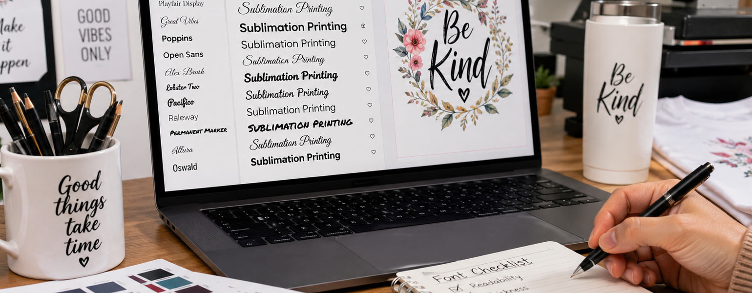
In the world of sublimation printing, font choice is one of the most overlooked design decisions. Yet it can have a huge impact on readability, production efficiency, customer satisfaction and even sales performance.
As more creators, Etsy sellers and small businesses enter the personalised products market, many are searching for ways to make their designs stand out. That often leads to highly decorative fonts, trendy handwritten styles and experimental typography.
The intention is understandable.
The results are not always ideal.
Let’s look at why fonts matter so much in sublimation printing and which font styles consistently produce the best finished products.
Why Fonts Matter More in Sublimation Printing Than Most People Realise
When people design for digital use, they are usually working with screens.
Screens are forgiving.
You can zoom in, enlarge text, and view designs in perfect lighting conditions.
Printed products work differently.
Once a design is transferred onto a mug, T-shirt, coaster, cushion cover or tumbler, there is no zoom function.
The customer sees exactly what is printed.
This means font selection directly affects:
- Readability
- Professional appearance
- Product value perception
- Design balance
- Production consistency
- Customer satisfaction
A poor font choice can make even a beautifully designed product feel amateur.
A good font can make a simple design feel premium.
The Biggest Mistake: Choosing Fonts for Style Instead of Function
Social media has encouraged a trend towards increasingly decorative typography.
Many designers scroll through Pinterest or Instagram and discover highly artistic fonts with dramatic swashes, exaggerated curves and elaborate flourishes.
They look fantastic in portfolio images.
They often perform poorly in production.
What Happens in Real Products
Thin lines may disappear.
Small decorative details can become blurry.
Overlapping characters can lose definition.
Complex letterforms may become difficult to read from a normal viewing distance.
This issue becomes even more obvious on smaller products such as:
- Mugs
- Keyrings
- Phone cases
- Coasters
- Christmas ornaments
The design might look impressive up close, but customers rarely inspect products from a few centimetres away.
Readability always matters.
Why Thin Fonts Frequently Cause Problems
Minimalist typography has become incredibly popular.
Many modern fonts feature ultra-thin strokes and delicate lettering.
They work beautifully in branding projects and website design.
Sublimation printing presents different challenges.
Fine Details Can Fade Visually
Although modern sublimation printers are highly capable, extremely thin strokes can lose visual impact after transfer.
The issue becomes more noticeable when:
- Printing at smaller sizes
- Using textured substrates
- Applying designs to fabric
- Viewing products from a distance
The text may technically be present, but it no longer commands attention.
Better Alternative
Choose fonts with medium stroke weight.
They maintain clarity without looking bulky.
This simple adjustment often improves the finished product dramatically.
The Hidden Risks of Overly Decorative Script Fonts
Script fonts remain one of the most popular categories in personalised products.
Customers love custom names, family signs and gift items featuring elegant handwriting styles.
The challenge is knowing where to draw the line.
Not All Script Fonts Are Created Equal
Some script fonts flow naturally and remain easy to read.
Others become tangled collections of loops and flourishes.
When letters start blending, readability suffers.
Customers should never have to spend time figuring out what a design says.
A Simple Test
Step back from your screen.
If you cannot instantly read the text from a distance, your customer probably cannot either.
Why Font Choice Matters When Using a Cutter Plotter
Many sublimation businesses also use cutter plotters during production.
Whether creating vinyl elements, layered graphics, contour-cut stickers or hybrid decoration projects, typography behaves differently once cutting enters the process.
This is where font selection becomes even more important.
Tiny Details Create Cutting Challenges
Fonts with excessive decorative elements often contain:
- Extremely small internal spaces
- Sharp corners
- Narrow bridges
- Intricate flourishes
These details may look attractive on screen but can complicate cutting operations.
The result may include:
- Weeding difficulties
- Material waste
- Increased production time
- Damaged lettering
Cleaner Fonts Improve Workflow
Simple, well-balanced fonts tend to cut more consistently.
This saves time during production and reduces frustration.
For businesses producing large quantities of personalised products, this efficiency can make a noticeable difference.
The Relationship Between Font Size and Product Type
A font that performs brilliantly on a large wall panel may struggle on a mug.
Likewise, a font designed for small applications may appear underwhelming on larger products.
Successful sublimation design always considers the final substrate.
For Mugs and Tumblers
Prioritise:
- Clean sans-serif fonts
- Readable script fonts
- Medium-weight lettering
For T-Shirts
You have greater flexibility.
Larger print areas allow more creative typography while maintaining readability.
For Home Décor Products
Decorative fonts can work well when used selectively.
The key is balancing visual interest with clarity.
Fonts That Consistently Perform Well in Sublimation Printing
There is no single perfect font.
However, certain fonts have earned strong reputations among experienced designers because they consistently produce reliable results.
Montserrat
Montserrat has become one of the most popular modern sans-serif fonts.
Why designers like it:
- Excellent readability
- Clean lines
- Professional appearance
- Works well at multiple sizes
It performs particularly well on mugs, apparel and promotional products.
Poppins
Poppins offers a modern look without sacrificing clarity.
Its geometric structure transfers beautifully onto a wide range of sublimation blanks.
Many sellers use it for:
- Business branding
- Personalised gifts
- Contemporary designs
Bebas Neue
When bold impact matters, Bebas Neue remains a favourite.
Its strong letterforms maintain visibility even from a distance.
Ideal for:
- Sports designs
- Men’s apparel
- Statement graphics
Open Sans
Open Sans continues to be one of the safest choices available.
It is easy to read, versatile and highly dependable across different product categories.
Playfair Display
For more elegant projects, Playfair Display provides sophistication without becoming overly complicated.
It works particularly well for:
- Wedding gifts
- Home décor
- Premium personalised products
Script Fonts That Usually Deliver Better Results
Script fonts are not the enemy.
The key is choosing script fonts that prioritise readability.
Great Vibes
One of the most widely used script fonts in personalised products.
Elegant yet surprisingly clear.
Allura
Allura provides a handwritten appearance while remaining easy to read.
This balance makes it particularly useful for names and short phrases.
Alex Brush
A popular choice for gifts and decorative products.
It offers character without excessive complexity.
What Market Feedback Tells Us
One interesting trend appears repeatedly across personalised product marketplaces.
Customers often say they want unique designs.
Yet the best-selling products are rarely the most complicated.
In fact, many top-performing listings feature:
- Clean typography
- Simple layouts
- Strong readability
- Balanced spacing
Why?
Because customers buy products they can immediately understand.
A design that communicates clearly often outperforms one that tries too hard to be different.
This is especially true for personalised gifts.
People want names, messages and quotes to be seen and appreciated.
Not decoded.
Practical Font Selection Advice for Beginners
If you are new to sublimation printing, there is a temptation to download hundreds of fonts and use the most unusual option available.
Try resisting that urge.
Instead:
Start with Proven Fonts
Build a small collection of reliable fonts first.
Master those before experimenting.
Test Before Selling
Print samples whenever possible.
What looks good on screen may behave differently on physical products.
Prioritise Readability
Customers remember products they enjoy using.
They rarely remember how decorative the font was.
Consider Production Efficiency
A slightly simpler font that cuts cleanly and transfers consistently often becomes the smarter business choice.
Designing for Products That People Actually Use
The most successful sublimation designs strike a balance between creativity and practicality.
Unique typography can absolutely help products stand out, but readability, production quality and customer experience should always remain the priority.
The best designers are not necessarily the ones using the most unusual fonts. They are the ones who understand how typography behaves in the real world, on real products and in real customers’ hands.
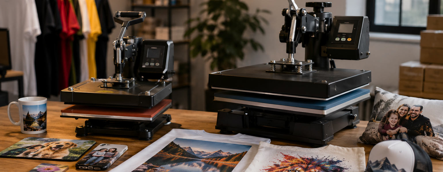
For businesses and hobbyists looking to improve their sublimation workflow, having the right equipment is just as important as choosing the right font. Signzworld offers a wide range of sublimation blanks, heat transfer materials, cutter plotters and printing supplies designed to help creators produce professional-quality results with greater consistency. Combined with thoughtful typography choices, the right tools can make a noticeable difference in both production efficiency and finished product quality.